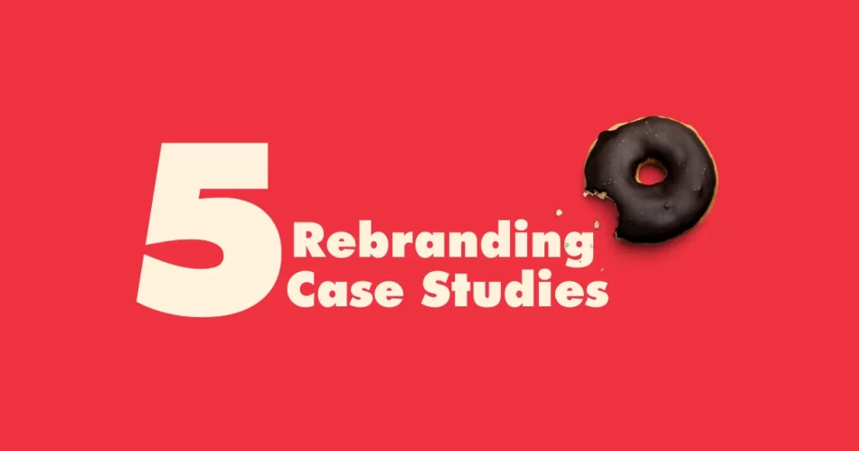
Remember how Tropicana’s rebranding flopped so hard that they lost $50 million in sales in just two months? Meanwhile, Dunkin’ dropped ‘Donuts’ and turned its brand into a powerhouse. Branding can make or break a business, and some redesigns go down in history for better or worse. Rebranding Case Studies
Let’s break down three iconic success stories and two epic fails that every brand should learn from. Buckle up!
The Wins: When Rebranding Nailed It
1. Dunkin’ – Dropping ‘Donuts’ Was a Power Move
Brief: Dunkin’ embraced a modern, coffee-first identity by streamlining its brand name and enhancing its menu beyond donuts. The move aligned it more closely with competitors like Starbucks.
What changed? In 2019, Dunkin’ dropped ‘Donuts’ from its name, going from Dunkin’ Donuts to just Dunkin’. The redesign also included a sleek new logo and a focus on coffee culture.
Impact: Sales skyrocketed, with a 2.4% increase in revenue post-rebrand. The new branding positioned Dunkin’ as a go-to coffee brand, competing with Starbucks rather than just being a doughnut shop.

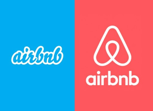
2️. Airbnb – From Awkward to Aspirational
Brief: Airbnb shifted from a transactional booking platform to an emotionally-driven community brand, emphasizing the concept of ‘belonging’ through a distinctive logo and user-centric website.
What changed? Airbnb’s 2014 redesign introduced the Bélo symbol, a universal icon of ‘belonging.’ They overhauled their website, making it more visual, community-driven, and premium.
Impact: The brand’s valuation surged from $10 billion in 2014 to over $100 billion in 2020. Their bookings skyrocketed as trust and emotional connection grew.
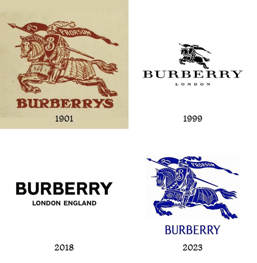
3. Burberry – From ‘Old School’ to Cool Again
Brief: Burberry’s 2023 rebranding embraced its British heritage while modernizing its image through bold visuals, a refreshed logo, and high-profile collaborations, ensuring it stays relevant to younger, fashion-forward audiences.
What changed? In 2023, Burberry unveiled a new direction under creative director Daniel Lee. The iconic serif logo made a comeback, replacing the minimalist sans-serif version introduced in 2018. The brand also leaned into its British roots with striking blue branding, fresh campaign visuals, and collaborations with cultural icons.
Impact: The rebrand reinvigorated Burberry’s luxury appeal, reconnecting with heritage while appealing to Gen Z and millennial shoppers. Social engagement surged, and the bold, refreshed aesthetic reinforced Burberry’s status as a trendsetter in luxury fashion.
The Fails: When Rebranding Backfired Hard
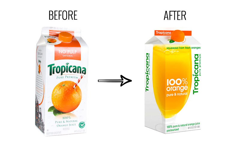
1. Tropicana – $50 Million Down the Drain
Brief: Tropicana underestimated customer loyalty to its iconic packaging, replacing the familiar orange-with-a-straw with a bland, generic look that confused and alienated buyers.
What changed? In 2009, Tropicana ditched its classic orange-with-a-straw logo for a ‘modern’ minimal look. Customers HATED it.
Impact: Sales plummeted by 20% in two months, costing the brand $50 million. They quickly reverted to the old packaging.
2️. Gap – A Rebrand So Bad It Lasted 6 Days
Brief: Gap’s sudden logo change ignored brand recognition and customer attachment, leading to massive backlash and a hasty return to the original design.
What changed? In 2010, Gap suddenly switched its iconic blue box logo to a plain Helvetica font with a tiny gradient square.
Impact: Public backlash was so intense that Gap reverted back within a week. The rebrand was estimated to have cost them millions.
Final Takeaway: Rebranding Is a High-Stakes Game
A great redesign can elevate a brand, boost revenue, and win new audiences. A bad one? It can wreck brand trust in days.
Before rebranding, ask: Does this align with our audience? Is there an emotional attachment to the old branding? Are we solving a problem or just making a change for the sake of it?
What’s your favourite (or least favourite) rebrand? Let’s talk in the comments! 👇