Ever feel like your creative juice is running dry?
You’re staring at your screen, shifting between fifty shades of blue, wondering if your design screams ‘trustworthy’ or just ‘boring.’ Well, here’s a reality check! Color isn’t just about looking pretty, it’s a mind game. It decides whether your design makes people feel excited, relaxed, hungry, or ready to swipe their credit card.
So, if you’re a designer still picking colors based on what “looks good,” it’s time for an upgrade. Let’s crack open the color psychology playbook and see how the world’s top brands are using it to attract attention, drive sales, and leave lasting impressions.
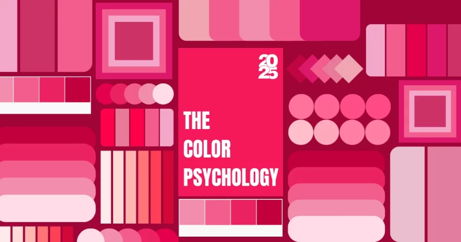
What is Color Psychology?
Color psychology in branding and marketing refers to the study of how colors influence consumer perceptions, emotions, and behaviors. It helps businesses strategically use colors in logos, packaging, ads, and branding to evoke specific feelings, create brand identity, and drive customer engagement.
Fact: In a study on the “Impact of color on marketing”, researchers found that 90% of snap judgments made about products can be based on color alone.
1. Colors That Control Minds (Yes, Really)
Think of brands that dominate their industry. There’s a reason why they pick certain colors:
- Red – Urgency & Appetite (Coca-Cola, Netflix, KFC)
- Blue – Trust & Stability (Facebook, PayPal, LinkedIn)
- Green – Growth & Health (Starbucks, Whole Foods)
- Yellow – Happiness & Energy (Snapchat, McDonald’s)
- Black – Luxury & Power (Nike, Chanel, Apple)
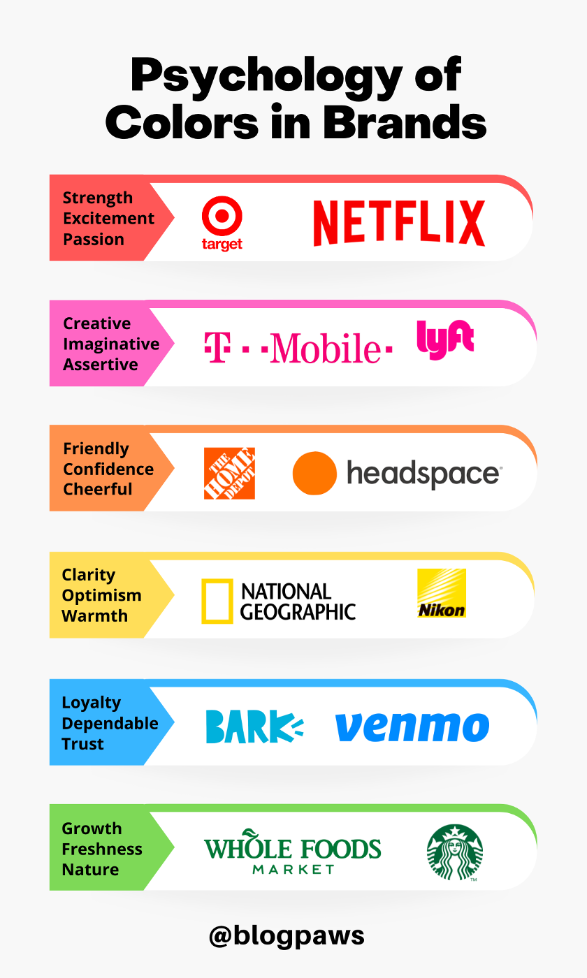
Ever wondered why fast-food chains love red and yellow? Science says they trigger hunger and speed up decision-making. Meanwhile, blue (often seen in tech and finance) is all about trust and dependability because no one wants to bank with a company that feels “risky.”
2. The Hidden Power of Color in UI/UX
A user lands on your website. You have 0.05 seconds before they decide if they trust your design. What makes them stay? Use this Color psychology:
- CTA Buttons: Want more clicks? Studies show that red and orange buttons tend to outperform blue and green ones.
- Dark Mode Revolution: More users prefer dark mode, meaning designers must rethink contrast and readability.
- Gradient Comeback: Instagram & Spotify’s gradient color schemes create a futuristic, high-energy vibe that keeps users engaged.
Design Tip: The wrong color choice can tank conversion rates. 92.6% of consumers say color affects their purchase decisions. So, yes, color sells.
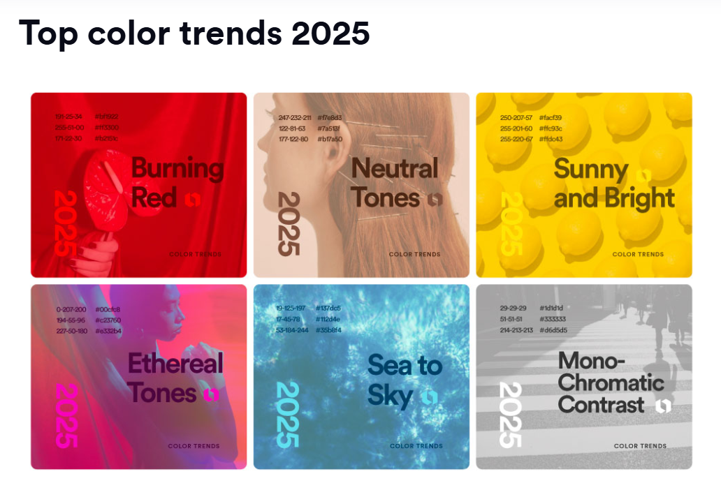
3. What is the Color Trend for 2025?
- Muted Earthy Tones – Less neon, more soft, natural palettes.
- Retro Vibrancy – Y2K-inspired bold gradients are making a comeback.
- Dark Mode Compatibility – No more blinding white UI’s, dark mode is here to stay.
Bonus Insight: Brands like Ultimez Technology focus on strategic color selection in branding and UI to enhance engagement and conversion.
Final Takeaway: Don’t Just Design, Manipulate Minds
Design isn’t just about looking good, it’s about influencing emotions and actions. So the next time you’re picking a color palette, ask yourself: Is this just aesthetic, or is it psychological warfare? Because the best designers don’t just create, they control perception.
FAQs
The color of the year for 2025 is Moccha Mousse, a warm, earthy brown that reflects comfort, stability, and natural elegance.
Trending colors for 2025 include mocha mousse, digital lavender, cyber lime, deep teal, and earthy terracotta, blending warmth, technology, and nature-inspired tones.
The creative industry in 2025 will focus on AI-driven design, immersive experiences (AR/VR), sustainable creativity, and hyper-personalization, shaping branding and content strategies.