UX Design Tips
UX design Tips and trends have revolutionize the prospective user discern your website.
Keeping a business website enlightened is one of the success mantras of online marketing hit and overall business development. But how to keep it enlightened is a controversial issue because different opinions prevail in market. Here goes few UX design tips that web developers and online marketers rely on blindly.
The importance of logo is really seamless
Want to keep your website originally enlightened in the midst of online crowd? Design a catchy logo and ink it with the home page of your site. However, the digital marketing specialists says,
- A business logo should be made of high-resolution image
- It is ideally to be placed on the upper left corner of web pages,
- It is important to link your logo back to your home page so that visitors can navigate easily.
The logo will help to remember a business to its users and gradually an established logo will help in setting up a brand entity, which is vital for a business to develop.
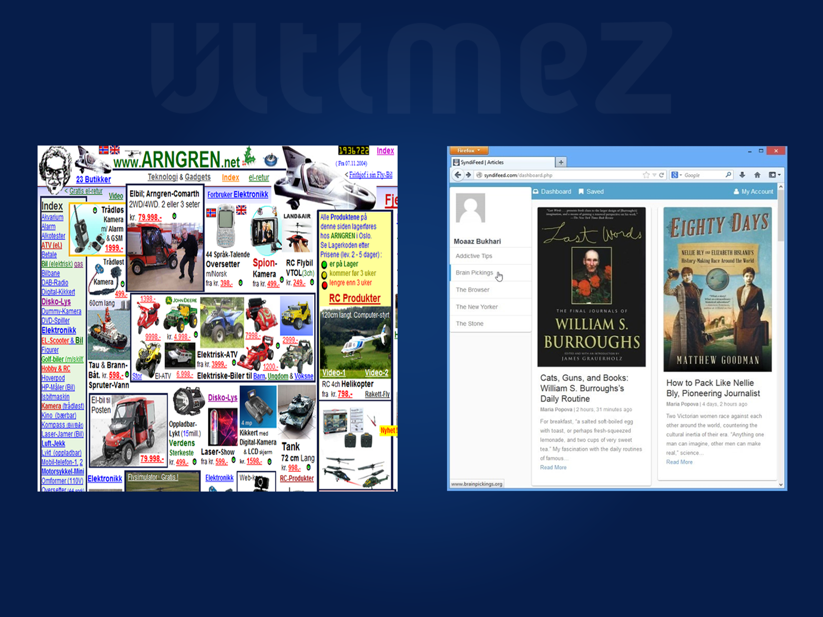
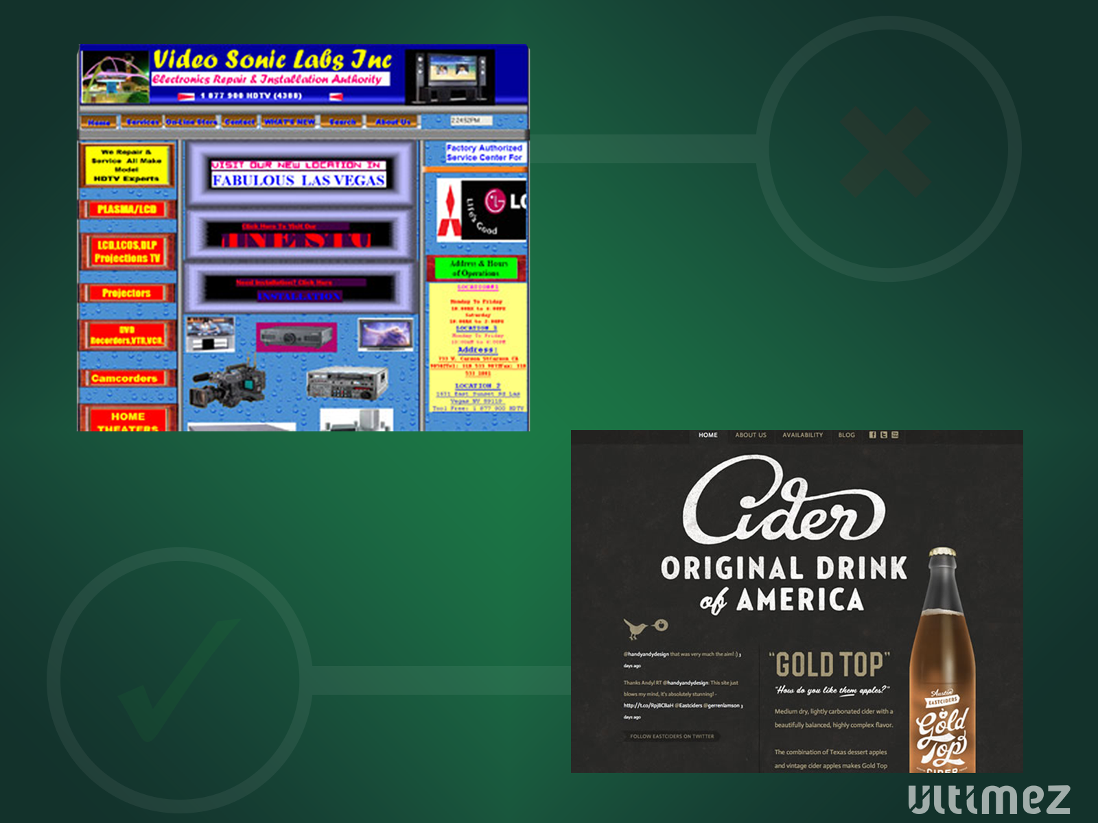
Remove clutter from your website design
It is important to remove extra graphics, animated gifts, and unwanted photographs from your website design. According to a renowned UX web developer now it is extremely important to limit the links and options in the header and footer to narrow the focus even further and enlightening the important content of the site.
However, here are few some recommendations
- It is better not to include competing call to action,
- It is wise to minimize loads of graphics, snaps, or animated gifs
- Limiting links is a good strategy
- It is always wise to format content in small paragraphs containing 5-6 lines maximum.
Use color with strategy
It is extremely important UX Design tips in overall web performance. According to Mark Hoben, the leader of Web design team at Egencia, Expedia group, neutral color palette adds clean, modern, and elegant appearance of a website. Therefore, the colors used must be similar to the colors used in the loge as well as other components of the website.
Related Article: PSYCHOLOGY OF COLOR FOR IMPACTFUL WEBSITE
Choose fonts that are easy to read across devices and browsers
Nowadays, people browse website not only from desktop but also from mobile screen. Therefore, you need to select a font that will capable of reading and viewing from a mobile device. The use of universal font in 11pt size is a better option for keeping it user friendly from its readability aspect.
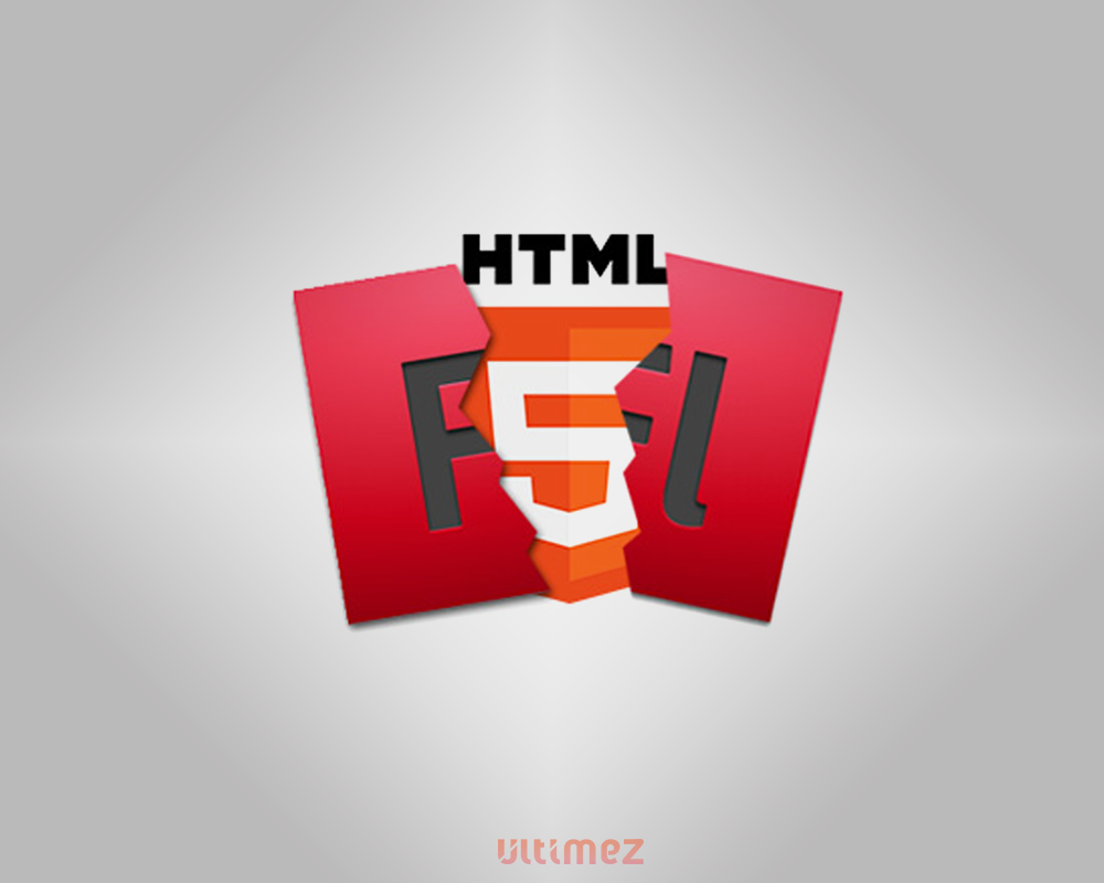
Forget flash, and embrace HTML
According to Darrell Benatar, CEO UserTesting.com, HTML5 is gaining better support on Web as it is more search-engine friendly and it has the ability to function on multiple mobile operating systems without use of plug-in. This is not applicable for flash, and that is why instead of flash HTML is a better option.
These are some of the proven UX key design tips that can keep your website enliven with a better impact on visitors’ psychology, which may bring better result.
Know Ultimez’s work; We are proudly known as Top Web Development Company in Bangalore


