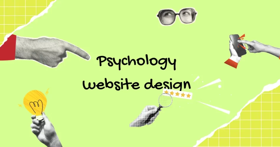
A great design is more than content, and its looks read out the Psychology website design with interesting insights. It’s all about visitors’ experience concerning your site when they visit it and the type of their feeling might be positive or negative- are completely in your hands and should not be overlooked with any feature.
To achieve the psychology of the viewers, one must understand how different web designs work and how you use them to affect the mood, experience, and attitude that visitors will have while viewing your website.
Space:
The main priority in any web page is organising perfect content, but the designer has to take into consideration the space it takes up on the site. White space plays an important role in web design work. As it gives a resting place for the visitors, and these are often found in margins and the space around things, which means if visitors are using your site and the whole site screen is taken up by words, graphics, it feels messy and makes them unhappy. So if you take the time to organise your content in a respectful space with relevant information that it gives professionalism and good vibes to visitors. Keep it simple with well-organised, with adequate white space that will help to convey to your visitors that you know what’s important and you never want to waste their time.
Colors:
Colors will help you to convey positive feelings, depending on lightness, type, the darkness of the colour and how much colour you opt to use. So it’s important to know that how these colours are used affects how the visitors feel when they visit your site, which is: Here is the complete guide on the Psychology of Color for an impactful website
- Cooler colors: blue, green, purple- inviting, professional and relaxed feeling
- Warmer colors: yellow, orange, red- soothing, warm, and sense of creativity. It also give a negative feeling like anger and stress.
- Neutrals: white- feeling of openness and could also feel bland and dull
- Gray: slick, modern ad clean but can be very cold and uninviting
- Black: professional and clean but also can be overpowering and nonspecific.
Font:
A font communities your brand to your readers and customers. Its main purpose is to be read but it’s not that people are trying to read your text instead it’s should happen. So the question which arises now is that what’s the right font? Luckily, there are only 2 groups of a font that are simple font and fancy fonts. No matter whichever you choose but the size of your font is vitally important. You need a font for headlines, a font for your body copy and accent font. So refrain using more than 2 or 3 different font types on your site. As it becomes confusing and your site goes for disgusting.
Now I pass it to you… what are your favorite font, color, and sense of space? Choose wisely and go higher with your business.
We at Ultimez Technology creatively convert our clients’ idea into successful website.
Contact us for more details.


Pingback: Ultimezshruti | Pearltrees