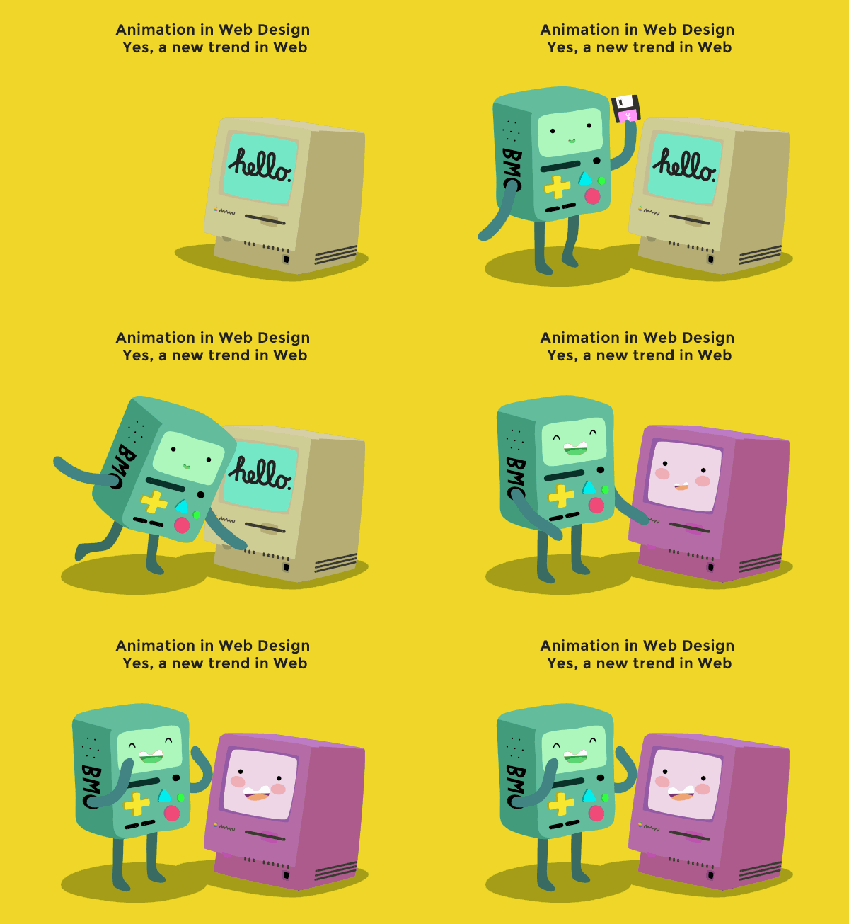
Animation in web design are no doubt a creative twist as animation in design induces dynamic variation and motion in website designing. It is like adding life is designing that makes a website more lively and attractive. Web designers call animation as the tricks of adding motion in scheming and that actively interacts with interface for better user experience. Now it’s globally seen that Best Web Designing Companies are prone to add animated features in website for better user appeal! and if used with proper mastery, animation in web can be designed to replicate real world interaction. The pleasant illusion of motion is one of the added attractions of animation, which has set a new trend in web designing.
Animation on the web: a brief history
The early technical predecessor of today’s animation was perhaps the GIF images. The use of GIF files for adding a dynamic approach was introduced in market since 1987. The images of dancing baby, talking parrot, or horror scenes were all introduced by GIF files in that early days. The demand of animation came in market not as a means to add more features in its utility but as a new trend of adding style and tinge of life in the so called static realm of web designing. A robust support by flash, animation gradually but steadily came into active use and that makes its use more dynamic and eye candy.
With advent of time, many web designers started showing their monopoly preference for JavaScript-based animation for smaller things, for example, dropdown menus and extra navigational basics. It was more SEO-friendly if it is done in the right way.
By the mid period of the last decade, W3C was introduced for using in animation plan under CSS specification. During 2009, the first public draft of the CSS animation spec was used.After 8 years, web designers are looking for ways to do more than add style to websites. Now it is a general trend in Website Design that the companies are trying their best to increase usability and strength of information to educate users, and to do creative use of animations not only for visual appeal but also for enhanced user satisfaction.
In short, perception of Animation for designing website is no longer a quality or uniqueness for web designers. It is necessity and for users it’s becoming the foundation of real interaction design. Therefore the Web Design Company Bangalore is assisting clients attain the best user experience on their website.
Types of web animation
Let’s come to business: animation and its use in webpage may not be the exactly same idea because one is practical application and there is a theory of animation and its utility. Let’s check here the special featured animations, widely used in website designing.
Interface element animation
This is the type of animation that allows users to know that their action (clicking, for instance) has been recorded. The click was the stimulator catalyst needed to boost something happen, no matter if that is navigating to another page, opening a sidebar, or offering modal window, or for sending an e-mail from a pre-set contact form.
It can be as simple as creating button backgrounds change, or making them bouncing. This category also covers the animations that creates sidebars “slide” onto the page, and the arrangement that makes modal windows expand themselves into existence.
Waiting animations
The utility of these animations was proven quite a long time back, when graphical type of user interfaces was first invented. It started using the way, for instance, the mouse cursor can get converted into an hour glass or in progress bars, etc. Apple introduced the “spinning beach ball of death,“ at some point, and Windows used the icon of files flying stylishly from one folder to another folder.
Animation in advertising,
According to Best Web Development Company in India if a web designer wants people look at an advertisement, animating them is a great boost to achieve the effect. But sometimes this type of animation comes with the problem hyper decoration, which may seem distracting. In the world of online sales, distraction can be fatally damaging.
Implementing Animation
The technical aspects of implementation really matters, but whether you’re using .GIFS, video, CSS, SVG, or even Flash (shudder), some customary principles are there that often matters more. Use these small tips, according to Best Web Design Company in Bangalore, to enjoy great users’ satisfaction in web designing you need to follow a few tips discussed below:
- If you wish to use the leverage of animation more as a designing tool, rather than a stylistic choice, it is safe and great to start small. Secondly, big and flashy animation should have a purpose other than just “looking great” in terms of utility.
- Most of the websites use animation for making UI elements “real” as well as semi-natural by look and feel. Before adding animation a competent web designer should understand if the big and flashy things moving around on-screen inform and offers better user experience than only adding beautiful pictures.
- So, when you’re creating objects moving, or stop from moving, it is better to allow them an allowance of little time ( maybe in milliseconds) to slow down or gear up. This is named as “easing,” and that will make animation livelier.
Animation in web design is still under research and experiment. Creative web designers are investing their best to induce new tweak and twist in web designing with animation. Want to create stunning animation effects in your website? Contact ULTIMEZ, which is an authentic Website Development Company Bangalore for the stunning website designing.


Pingback: Ultimezshruti | Pearltrees
Pingback: Blog | WebDesign Company in Bnaglore | The Future Web Designing Trends | ULTIMEZ TECHNOLOGY