Newsletter Layouts Design is quite interesting and economical way to drive massive audience at once. It still gives you the best offer to approach the audience and enhance the sales easily. But if you have never managed an email list before, this can be an unapproachable process.
If you have the email list, it has to send with an intent to connect with subscribers. A great content and Viberant Colors in Newsletter layout design can be a perfect convergent process.
Engaging Newsletter Layouts Design Tips:
-
Layouts with a single column:
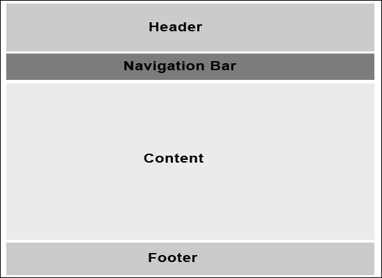
The email you send must be very small in size with very few and effective words or sentence because email readers like Outlook have more numbers of restrictions than web browsers.
It means that the average newsletter is rarely big than 600px wide, so it is always better to use a 1-coloumn layout.
Sometimes when you plan your content it is always good to work in single column format.
Think about how you can organize your writing so that it flows down the page and present an easy reading experience.
-
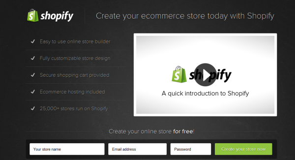
CTA Consist Of Well-Built Tool:
This is a link or button that promote the user to click and to do something extra!
It would definitely help to continue the shopping on your store, or read through your latest blog post and also help to download your new eBook – if effectively placed.
However, it is better to include a CTA in your email while delivering mail. You can also try running two CTAs next to each other if you have a larger audience.
This is effective when you have more general goals in mind with a large subscriber’s base.
For example, Shopify has CTAs in their emails.
-
Beyond The Fold Icon:
Since emails are so basic you really can’t do a lot with CSS3. Even they don’t have a navigation while you just get visitors right onto your website.
Pictures are the best thing to grab the attention immediately and selling an idea. Thereby it is always good to add an image, right above the fold near the header of your newsletter.
Great photographs can always pre-sell your product to the visitors. Henceforth, certifying an email/new seller contains imposing image would be a perfect conversion plan.
Related Article: Tips to choose Ecommerce Web Design
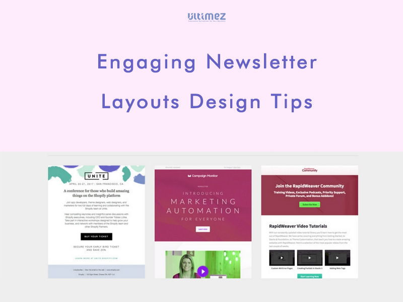
Grid & Box Lists:
If you are receiving lot of newsletters then you will probably recognize the box/grid layout design.
These are very common with the emails because they have a few distinct traits;
- Narrow page designs
- Short copy
- Meant to be consumed quickly
Final Thought
Engaging newsletter layouts are the most effective way to reach the customers. You need to connect with subscribers with emails for increasing sales. Columns with the single layout are also very useful & helpful, as emails must be small to read so that the readers will not get bored to read by looking at the length. Emails having stronger CTA could ensure people to continue shopping on your store, and get the latest information through a blog post. Newsletters usually recognize the box/grid layout design.
However, along with these tips, it is essential to follow the trends and user’s behavior. Newseller with trending UI design and persuasive content could be a more affordable way to grab the attention of an audience. In addition, Logo included Newsletter could be a great to proceed- this will ensure readers remember your offer & company.